

Garden Grow is a semester-long branding project with the goal of creating a toolbox that includes everything you need to support a visual identity. This truck not only serves plant-based meals but also spreads a message of sustainability, health, and eco-conscious living. They use biodegradable packaging, source ingredients locally, and practice zero-waste principles. The bus also partners with local schools and organizations to promote healthy eating and environmental awareness.
Logos
•
Patterns/Textures
•
Typography
•
Logos • Patterns/Textures • Typography •

The main logo features a plant growing in a greenhouse encompassed in a rainbow. The little plant and greenhouse symbolize growth, nourishment, and the brand’s commitment to fresh, locally sourced ingredients. The rainbow adds a fun touch, aligning with the retro VW bus food truck while highlighting their eco-conscious and positive approach to healthy living. Paired with our tagline, peace, love, and greens, customers will know we are plant-based and delicious. The secondary logo features our name alongside our recurring plant icon. Found on our worker's shirts and menu is an illustration of the bus food truck. Textures for our branding are neutral and natural.


The type utilizes two main fonts, Fairwater Script and Transat. Transat is a geometric sans serif typeface paired with a Fairwater, a light and playful script with lots of glyphs. There are two patterns utilized throughout the brand system. The first is a tonal pattern featuring fruit and vegetable icons. This pattern can be found on our food truck and takeaway bags and boxes. The second pattern uses different logo variations and has a light an dark version, found on food wrapping.


About the Menu
Our menu is split into five categories: sandwiches & wraps, sides, drinks, salads, and desserts. Each section is signified by its header. Each menu item is bolded with its price and a description of the item below it. At the top is our bus food truck and an outline mimicking the logo encompasses the menu. To break up the space, the drinks are highlighted in the middle of the menu in an abstract shape that compliments the color blocks seen throughout the menu. Two illustrations can be found in the bottom third to bring in some color and iconography.


Collateral
-
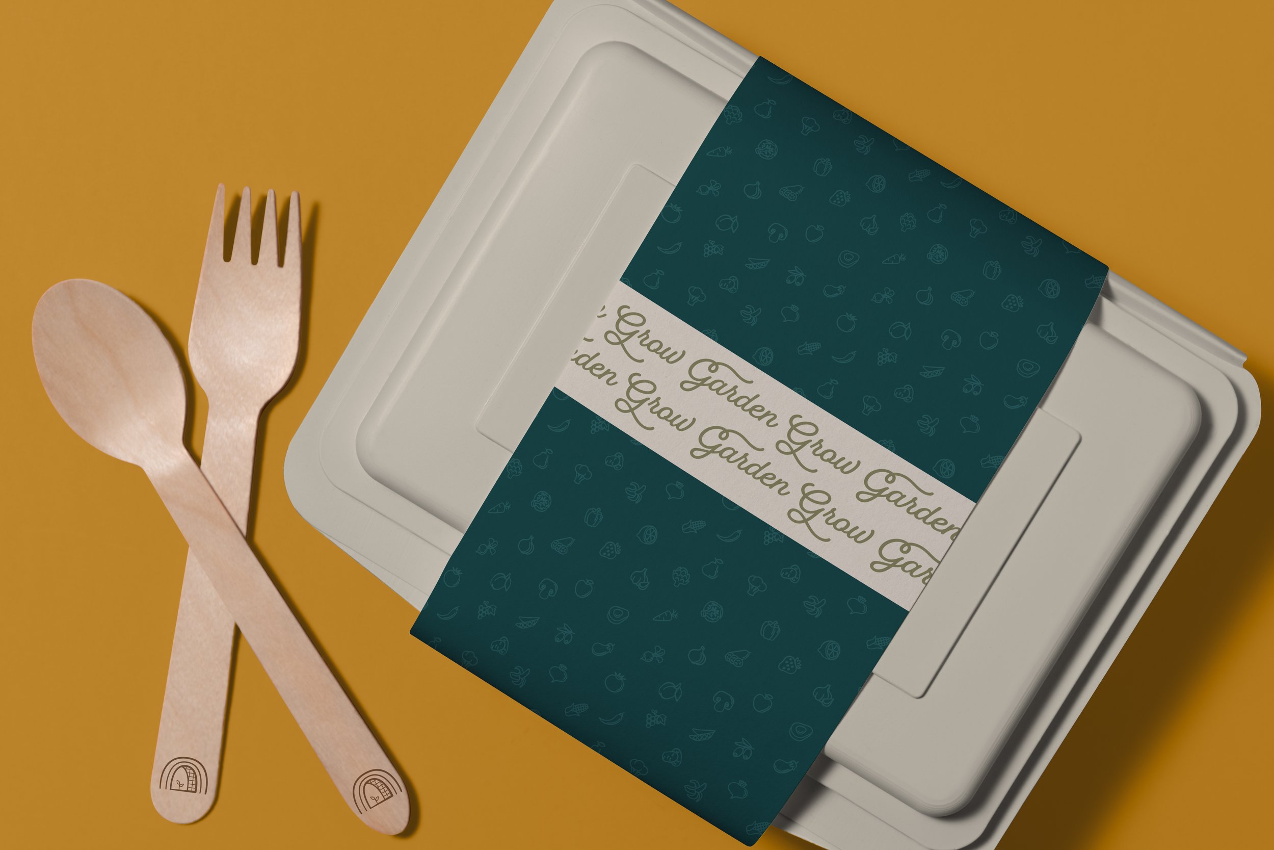
Our recyclable takeaway box features a typographic treatment and pattern. Even our silverware is branded with our logo.
-
Our sandwiches and wraps are all inside fun paper that makes unwrapping your meal even better.
-
Our recyclable takeaway bag lets everyone know you have delicious, healthy food inside!
-
Our workers all wear t-shirts featuring the food truck and a typographic treatment on the back, which can be purchased by customers.


VW Bus Foodtruck


Social Media and Advertising
Above features a series of three advertisements created for our Instagram stories. The goal is to highlight specific items from our menu for customers and alert them to where our truck will be located. The chia seed pudding changes based on the season, so this story lets customers know what toppings are currently available. The next shows customers our food truck in its spot with the location featured on the bottom pinpointed with our plant icon. One of the most popular items, our classic veggie burger, is featured with a combination of pattern, type, and overlays to appeal to customers in a fun and engaging way. To attract new customers, I created two different animations below using different logos to be used on brand socials.
Credits
Class: Branding
Instructor: Georgena Senior, Tyler School of Art and Architecture, Temple University
Stock Photography sourced from Adobe Stock