Enhancing Website Accessibility: A Case Study and Redesign Approach
This is a case study for Lipton, a very popular tea company. An estimated 2 million people drink Lipton Ice tea a year. It is important to note that this audit will mainly focus on accessibility not the visual design aspects of the website.


Why Does This Matter?
A crucial aspect of digital presence that often goes overlooked but is absolutely essential is accessibility. Every user, regardless of their abilities, should have equal access to information and services online. Accessibility is about ensuring that everyone, regardless of their physical or cognitive abilities, can navigate and interact with online content seamlessly. Visual impairments, such as color blindness, low vision, and complete blindness, can significantly influence how users perceive and interact with websites. Imagine trying to read text that blends into the background or using a website without clear contrasts or navigation. These challenges can make browsing frustrating or even impossible for many users, especially those with disabilities.
The Web Content Accessibility Guidelines (also known as the WCAG) are a set of standards developed to ensure that digital content is accessible to people with disabilities. They provide criteria and guidelines for making websites, applications, and digital content more perceivable, operable, understandable, and robust for all users, regardless of their abilities. Thanks to the (WCAG), businesses are not only encouraged but legally obligated to ensure their websites are accessible to all.

There are 8 million people in the US with vision impairments. This often affects their ability to interact with digital content.
This is Jim, a 35-year-old male. Jim has deuteranopia, also known as color blindness, which affects his ability to distinguish between certain colors. As someone with a visual impairment, some of his needs include Textual Labels, meaning do not rely on color alone to indicate information. Use additional cues or icons to convey content. Also, High Color Contrast for readability and Color Consistency, meaning it is important to keep colors consistent throughout and use specific colors for buttons and other interface items.
The first criterion I want to focus on is contrast. The contrast guidelines specify the minimum contrast ratio between regular text and its background is 4:5:1 to ensure readability for users with visual impairments. Higher numbers indicate better contrast, and it must meet certain thresholds for compliance at three levels: A (basic), AA (intermediate), and AAA (advanced), with AAA being the highest and most accessible standard.

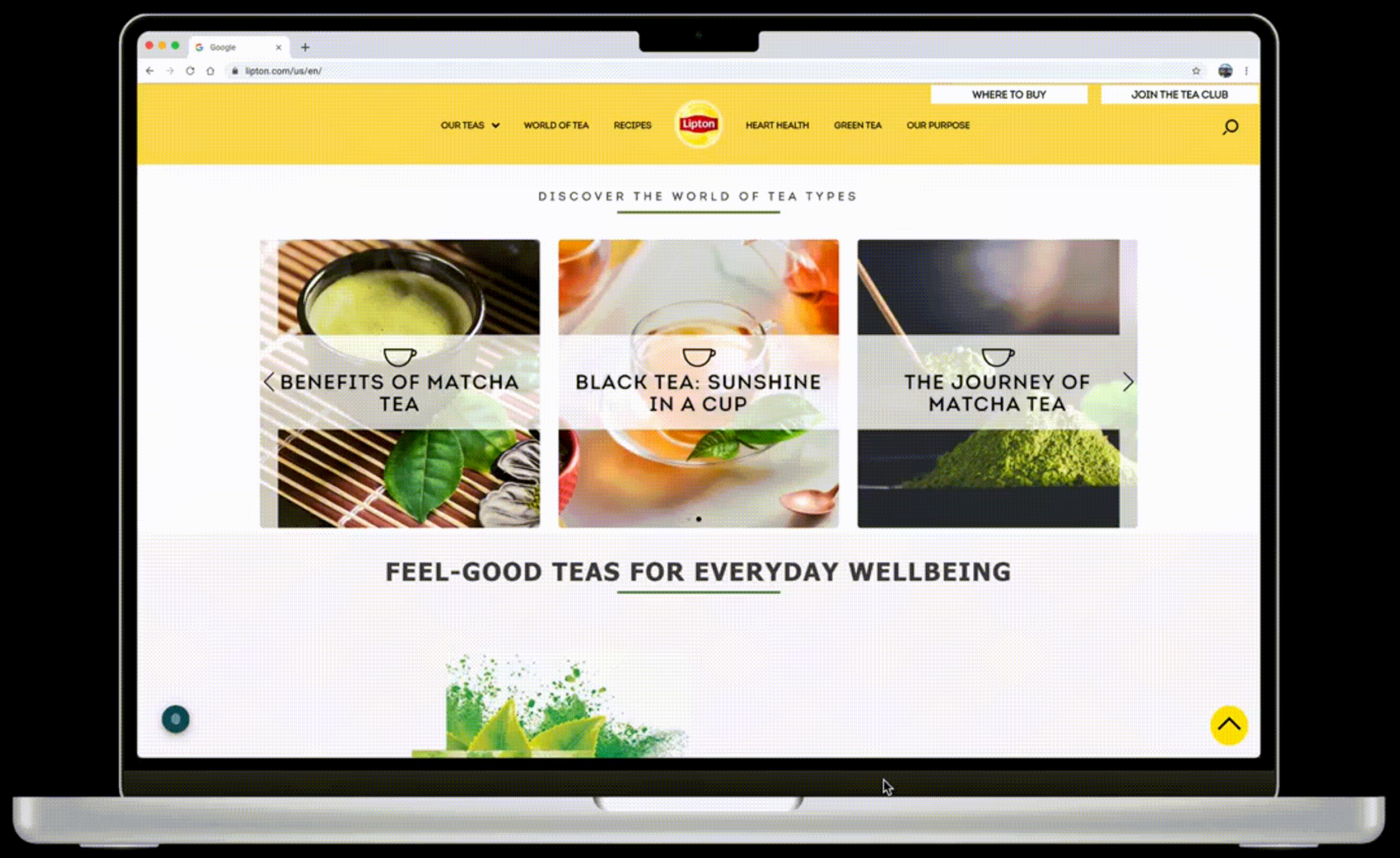
Lipton uses the branding colors of white, yellow, and light green which are not accessible with each other. On the top, you can see the current failed ratios and on the bottom, you can see the new accessible ratios.

This is a redesign I did for the green tea section of the website. Before the white on the green and the yellow on the green were not compliant. I have recolored the green to be darker but still matches the rest of the website. This is now AA-compliant for regular text and AAA-compliant for large text.

I have also redesigned the homepage. In the before, there are white icons on a yellow background and white rules under title text and in the dropdown menu. In the redesign, I have changed the icons to black, turned the title rule green, and removed the dropdown section separators.

In contrast, we also have the hamburger menu. The hamburger menu text is changed from white to black, which is now AAA compliant.

The next criterion I want to focus on is Use of Color. This means that color is not the only visual means of conveying information. On the top, you can see the before. In the carousels throughout the website, all of the images are links to open a new part of the website depicted using a transparent yellow triangle when hovering over the image. Also when tabbing through there is no focus indicator (2.4.7) or way to know which image you are on. Also, the yellow icons are not readable. In the after below, I have changed the title rule to green to adhere to contrast and I have added a white transparent shape behind the text which increases text readability but still allows you to see the image behind it. I also kept the yellow hover state to keep with the branding but added a black outline around each box to indicate which image you are on.
Next is keyboard accessibility. This means that all functionality of the content is operable through a keyboard interface. On the Lipton website, tabbing through with the keyboard does not read any of the body text. So as you can see on the right, when tabbing through a recipe page, it skips the recipe information and goes straight to buy tea.

This new tabbing order creates a way for users to tab through and access the ingredients and steps for a recipe. Now all of the content is operable through a keyboard and the web page can be navigated sequentially in accordance with Focus Order (2.4.3)


A bypass block allows for users using the tab button or a screen reader to skip over the navbar so it is not repeated each time you open a new section of the webpage. Currently, you have to click through the navbar on each page including the dropdown.

In the top left is the newly added bypass block that is easily visible and allows users to skip over the navbar.

A bypass block has been added for carousels so they can be skipped over and the user will not have to tab through all the image links if they do not want to.
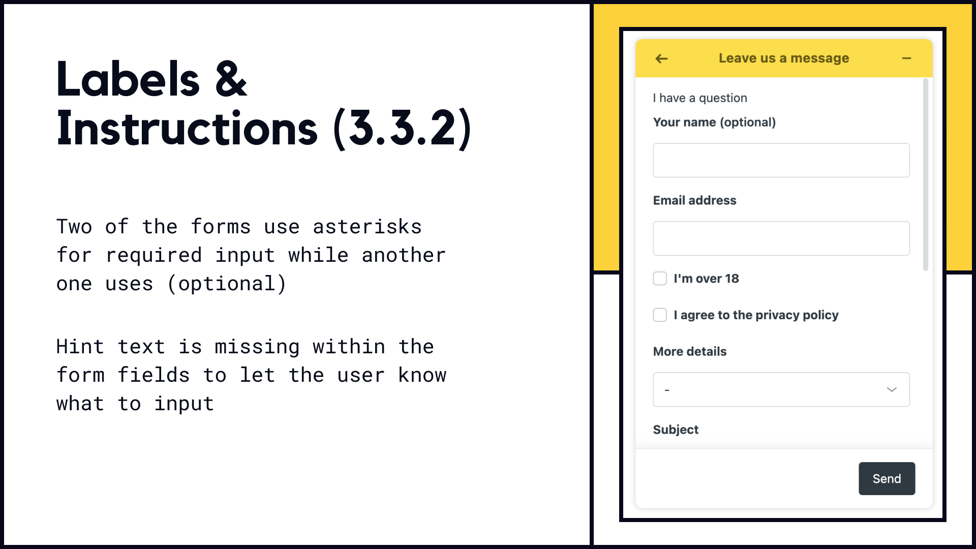
Criterion 3.3.2 indicates that labels or instructions are provided when content requires user input. Two of the forms on the website use asterisks for required input while this one uses (optional). Hint text is also missing within the form fields to let the user know what to input.

Hint text has been added for the user which improves accessibility by ensuring that all users can understand and interact with form elements. This new form uses asterisks consistent with the other forms which follows Consistent Identification (3.2.4).
Recap
Web accessibility ensures that all users, including those with disabilities, can access and interact with digital content, fostering inclusivity and enhancing user experience for everyone. It is important that you prioritize accessibility in projects as it not only expands the audience reach but also demonstrates a commitment to inclusivity, increasing customer satisfaction, loyalty, and overall business success.
Credits
Class: Designing for the 13%
Instructor: Gary Dawkins, Tyler School of Art and Architecture, Temple University
Imagery sourced from Lipton