
Candy Cabinet
Candy Cabinet is a retro candy store located on the Coney Island Boardwalk that transports visitors back to the simpler, sweeter days of their childhood. We have everything from penny candies, candy cigarettes, and wax bottles to Charleston Chews, Necco Wafers, and Pop Rocks. The centerpiece of the store is the salt water taffy wall, a colorful display that stretches from one end of the store to the other with countless flavors. For those who want to enjoy their taffy on the spot, there’s a seating area with retro diner-style booths and tables. This gives customers a chance to relax, chat, and enjoy their taffy with a soda or milkshake from the store’s vintage soda fountain. This store allows people to relive their youth and introduce their favorite sweets to new generations.

type, patterns, logos, color palette, and icons

For the logo I wanted to keep it very clean, colorful, and typographic. After playing with a few fonts I landed on Escafina, a retro and fun bold script typeface. The font itself is inspired by vintage signage and mid-century advertising, which fit perfect for this retro candy shop. I paired it with Brandon Grotesque, a simple sans serif with many different styles and weights. I started playing with the taffy motif but decided on a more simple logo with a colorful swirl. The secondary logo is the “C”.
Logo & Type
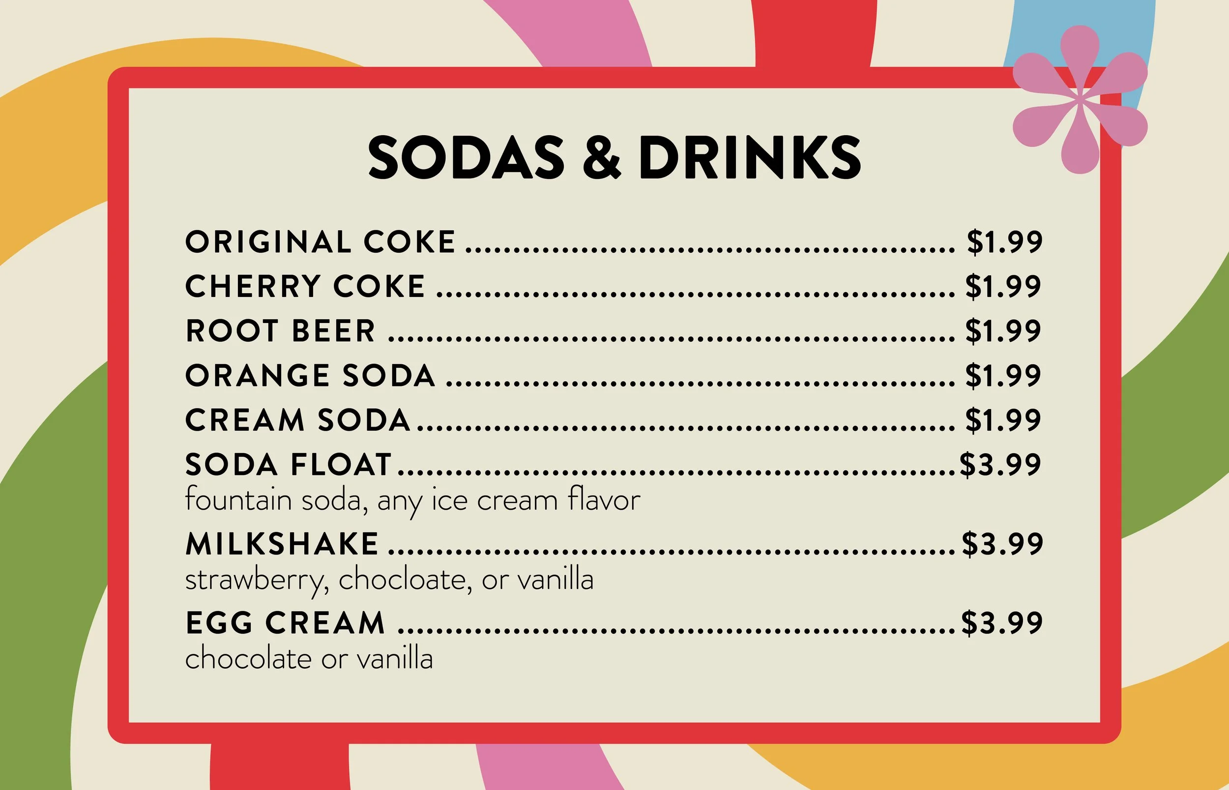
Menus
〰️
Menus 〰️
I have two different menus, both environmental. One consists of all of our taffy flavors while the other consists of sodas and drinks. Both mimic the colors from the logo to keep them playful and readable.


Environmental
When designing the facade and other environmental factors it was important to set the scene of the restaurant. The facade especially, features color blocks to show the fun, retro, nature of the brand.


Advertising
Because Candy Cabinet is located on the boardwalk at Coney Island, I wanted to do a plane advertisement to play into that. I also did three posters which would be displayed along the boardwalk. The posters feature images of the individual taffy and text relating to our tagline to draw the viewer to our restaurant.


Packaging
The packaging consists of cups, cellophane bags, patterned straws, and takeaway bags. The bags utilize our tagline, “BRINGING YOU SWEET NOSTALGIA” and also our secondary logo, playing with scale.


Collateral
For collateral I made two glass jars, cups, napkins, and patches. The jars feature the word “SWEETS” mimicking the tagline. The cups use our checkerboard pattern featured on the facade. The napkins use the swirl pattern from the logo and all of the colors in the palette as well.


Website
The website consists of five sections, about, location and hours, featured favorites, taffy flavors, and shop. It starts off with an about section to tell you a little bit about our brand, then goes into location and hours. It then shows four featured taffy flavors, which you can order directly. It also shows all of the taffy flavors from our menu and a shop. In the shop, you can shop individual taffy, bags of taffy, and other products.
Conclusion
Candy Cabinet was a super fun brand to create and learn from. I learned a lot about all of the different aspects and deliverables when creating a brand. With this brand I learned how to keep things simple and that sometimes less is more. With the help of my instructor, I was able to portray a playful yet refined feeling. This brand really exemplifies how a well-crafted brand system can transport people to a different time and evoke a sense of joy and nostalgia.
Credits
Class: Advanced Graphic Design
Instructor: Katey Stafford, Tyler School of Art and Architecture, Temple University
Stock Photography sourced from Adobe Stock